
Create your shopping list once. Shop efficiently anywhere.
A concept exploring how location-aware shopping lists can improve the supermarket experience while creating value for retailers.
01. Overview
Role
Product Designer
Project Type
Concept
Platform
iOS App
UX Research, Product Strategy, UI Design, Prototyping
Focus
Every supermarket is laid out differently, yet your shopping lists stay the same. Whether you're visiting another branch of your usual supermarket or shopping somewhere completely new, finding your way around often means backtracking, forgetting items, or wasting time searching for products.
Aisle is a location-aware shopping list that automatically reorganises items based on the layout of your chosen supermarket, helping customers shop more efficiently while enabling retailers to deliver personalised promotions and gain deeper insights into shopping behaviour.
Problem
Shopping lists don't
adapt to store layouts.
Solution
Automatically reorder
lists by aisle.
Outcome
Faster shopping and better retailer insights.
02. Problem
Shopping lists are personal. Most people write them in the order that feels natural to them, not in the order of the supermarket they'll be visiting.
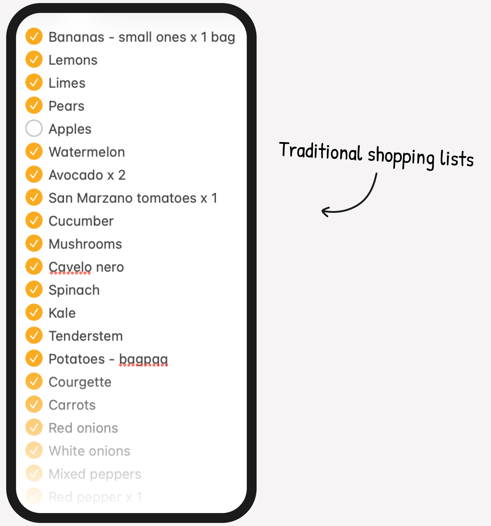
Because every supermarket, and often every branch, has a different layout – shoppers are forced to navigate the store inefficiently. They frequently double back through aisles, miss products, and waste time trying to remember where items are located. The longer the trip takes, the more likely customers are to forget items, make compromises, or abandon purchases altogether.
This creates a frustrating experience for shoppers while also representing missed sales opportunities for retailers.
03. Opportunity

Once customers arrive at the supermarket, those lists remain static. They don't account for differences in store layouts, individual branch variations, or the most efficient route through the store. As a result, shoppers still spend unnecessary time navigating aisles, doubling back, and searching for products.This presents an opportunity to rethink the shopping journey. Instead of expecting customers to adapt to every supermarket they visit, the experience can adapt to them. By intelligently reordering a shopping list based on the layout of a chosen store, the app creates a faster, more intuitive shopping experience while helping shoppers save time, reduce frustration, and avoid forgotten items.
At the same time, retailers benefit from valuable insight into shopping intent and have new opportunities to surface relevant promotions and offers at the right moment in a customer's journey.
Grocery shopping is a weekly routine for millions of people worldwide, making it a product with enormous potential reach. While digital shopping list apps such as AnyList, Listonic, and Bring! have simplified the process of creating and managing shopping lists, they focus primarily on list creation rather than the shopping experience itself.
Customer benefits
Shopping efficiency
Automatically organise shopping lists based on the layout of the selected supermarket, reducing unnecessary walking and backtracking.
Reduce cognitive load
Remove the need for customers to remember where items are located from shop to shop.
Accessibility
Supports neurodiverse shoppers by providing a familiar and predictable shopping experience, regardless of which supermarket or branch they visit.
Save time
Automatically organising shopping lists into the optimal in-store route, helping customers shop more efficiently while eliminating unnecessary backtracking.
Retailer value
Understanding intent
Gain insight into what customers plan to purchase before they set foot in a store, revealing shopping intent that traditional sales data cannot capture.
Improve offer discovery
Present personalised offers at the most appropriate moment in the shopping journey, increasing relevance without disrupting the experience.
Shopper tracking
Use shopping behaviour and demand trends to optimise store layouts, promotional placements and stock planning.
So then… how might we create a shopping list that intelligently adapts to any supermarket layout, helping customers shop more efficiently while giving retailers meaningful insights that improve the in-store experience?
04. The research
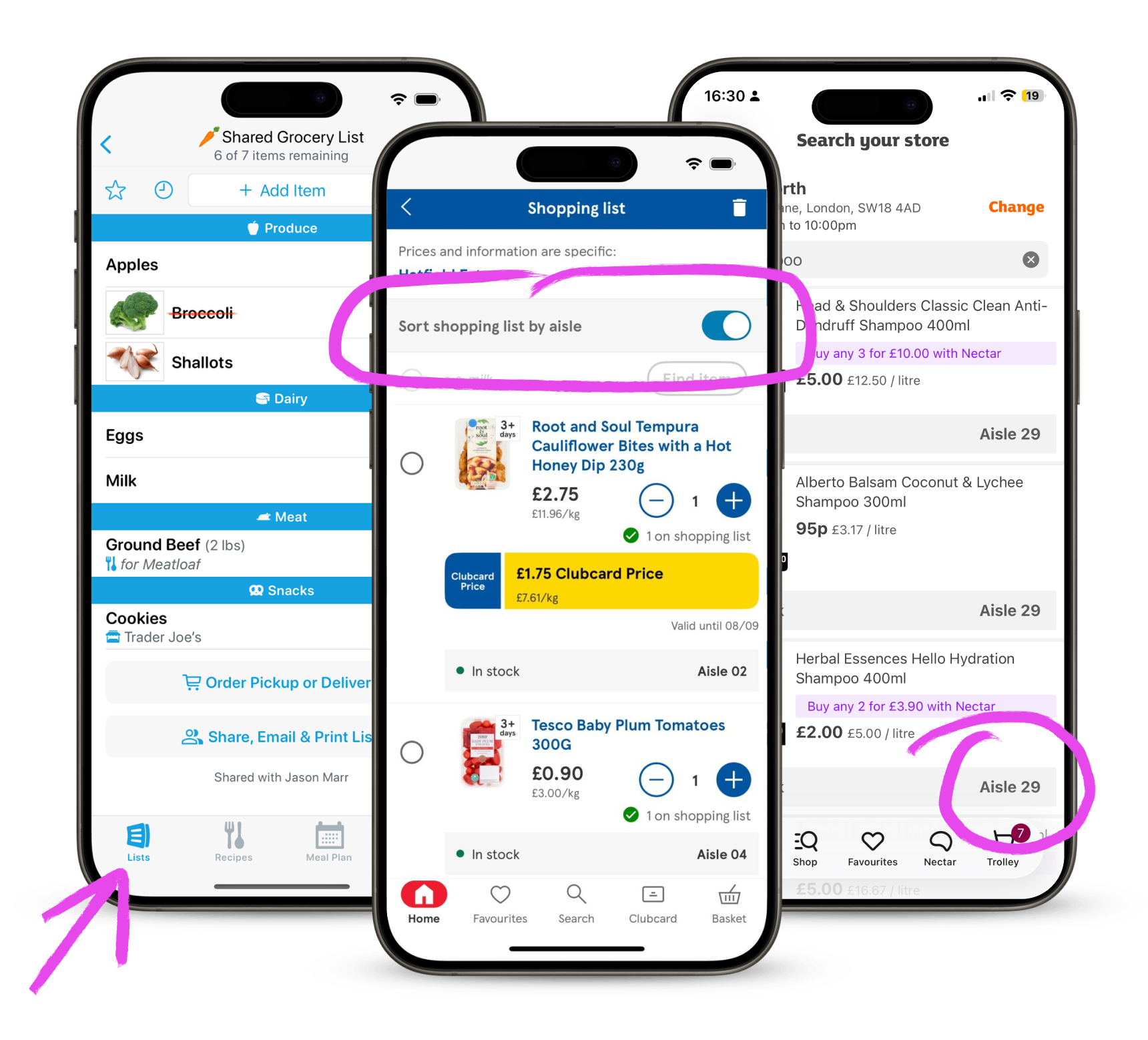
Competitor Audit
To understand how shoppers currently manage their grocery trips, I analysed several leading shopping list and supermarket apps. While many simplify list creation and offer personalised deals, none fully solve the problem of adapting a shopping list to different supermarket layouts and branches.
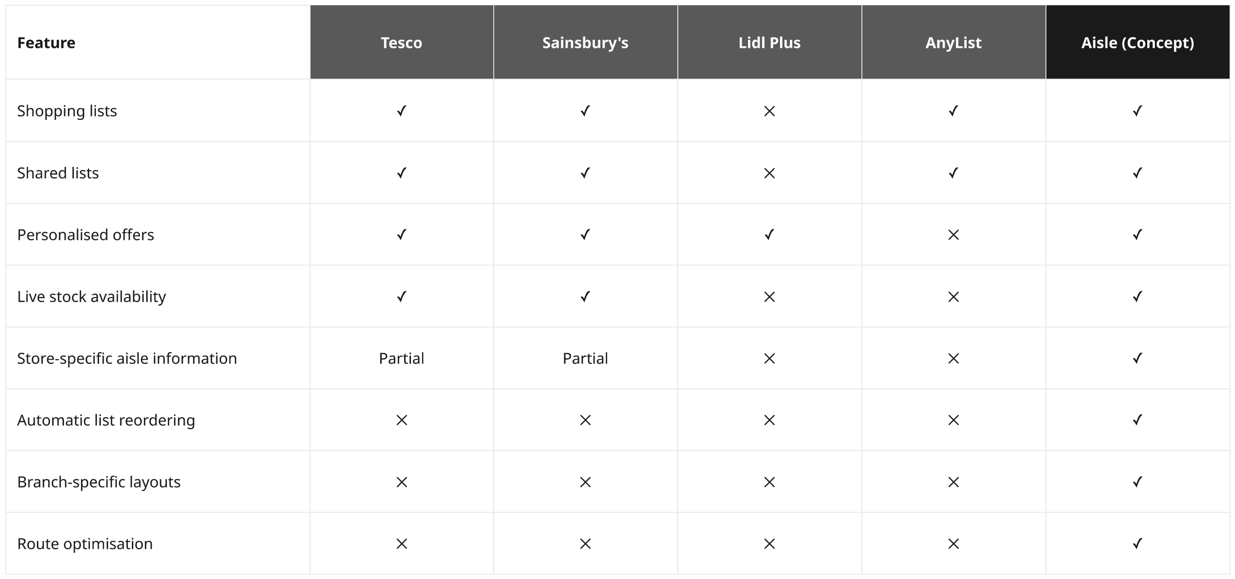
Key Findings
Existing shopping list apps
Apps like AnyList make it easy to create, share and organise shopping lists, but they rely on manually assigned categories. If a user visits a different supermarket, the list no longer matches the order of the store.
Supermarket apps
Retailer apps provide useful features such as loyalty rewards, offers and product search. Some can tell customers which aisle a product is in, but they don't reorganise an entire shopping list into the most efficient shopping route.
05. Success metrics
Customer
Shopping trip duration – Average time to complete a shop.
Route efficiency – Distance walked and number of backtracks.
Basket completion – Percentage of planned items purchased.
Customer satisfaction – Post-shop surveys and interviews.
Retailer
Promotion engagement – Views, taps and redemption rates.
Conversion – Completed shopping trips and average basket value.
Retention – Repeat usage and monthly active users.
Adoption – Percentage of customers returning to the app for future shops.
06. User flow
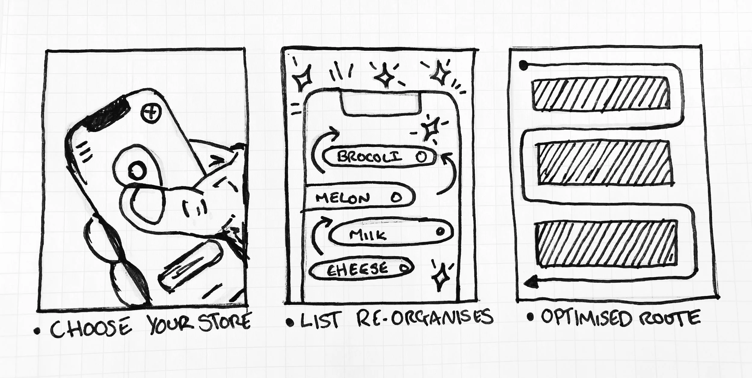
How Aisle transforms the shopping experience
Existing shopping lists work well when you're familiar with a store, but quickly become inefficient when layouts differ between branches. Aisle removes this friction by automatically reorganising the shopping list to match the selected supermarket, guiding users through the most efficient route from start to finish.
Current user experience
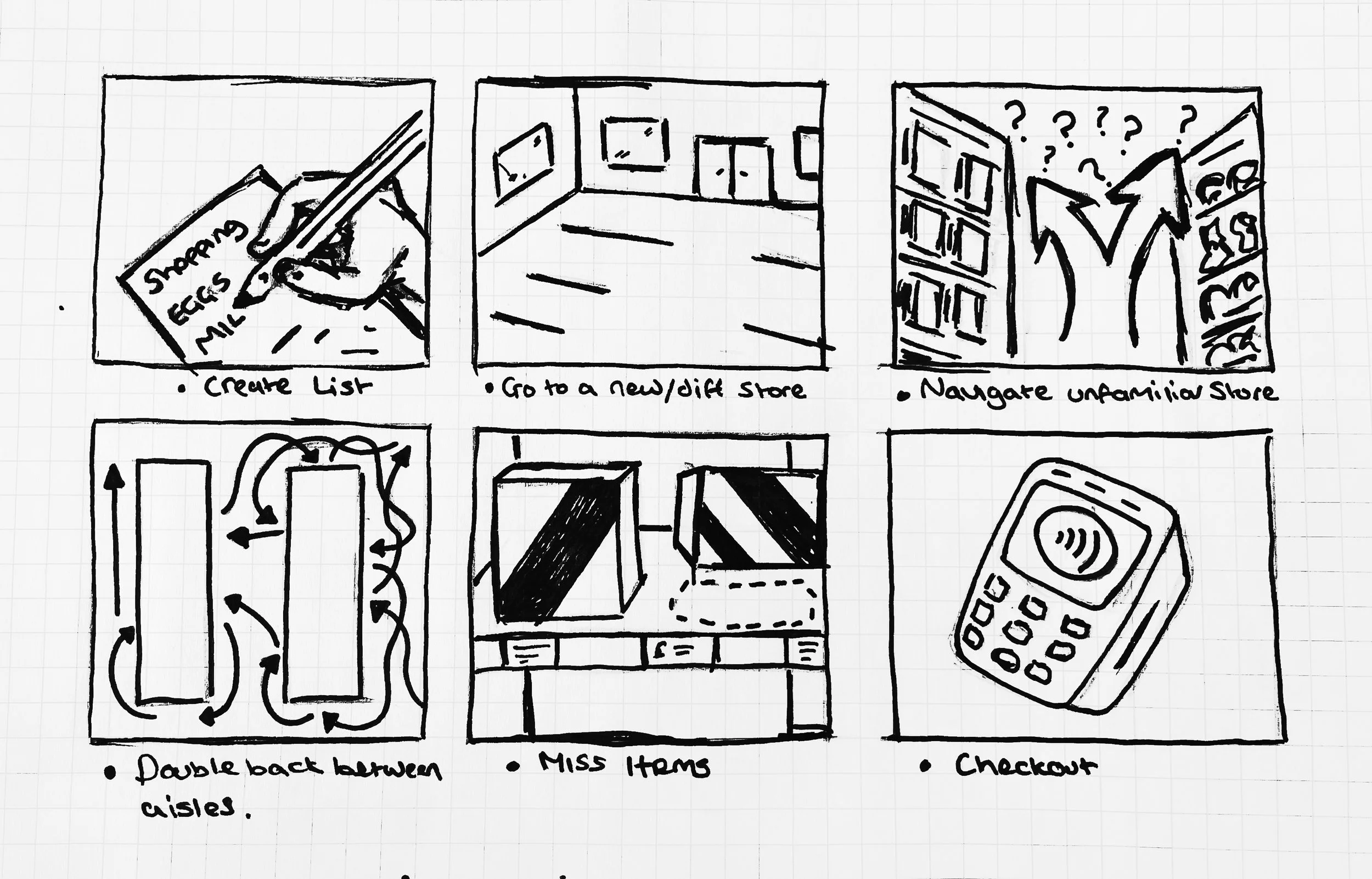
The Aisle Solution
Selecting a supermarket instantly reorganises the shopping list into the order customers will encounter products in-store.
07. Technical Feasibility & MVP Guardrails
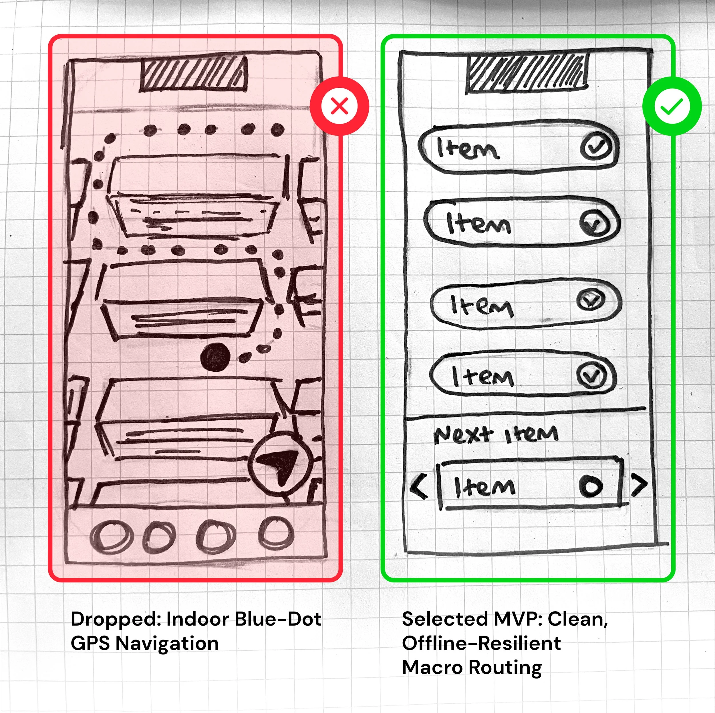
Before designing the application architecture, I collaborated with the engineering team to identify potential technical blockers. While I initially brainstormed real-time indoor navigation using public map APIs, I quickly realised it would result in a heavy, bloated experience prone to connection failures inside concrete store structures.
To ensure offline resiliency and app performance, I focused on keeping our data footprint as lightweight as possible. I opted for a macro-routing approach powered by crowdsourced UK supermarket data.
Instead of trying to track products to a specific shelf or bay (which changes frequently and would overload the system) the app organizes lists by broad aisle numbers (e.g., Aisle 4).
This technical constraint successfully protected our core UX vision: a fast, offline-capable, and completely streamlined shopping journey.
08. Information Architecture
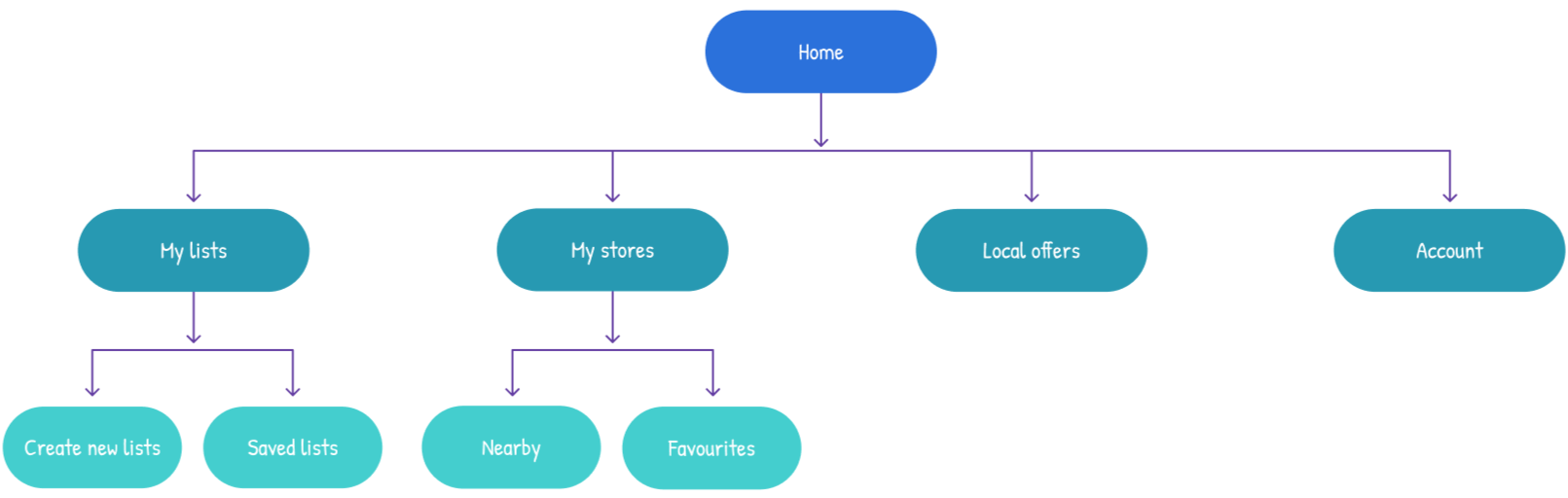
The information architecture was intentionally kept lightweight, prioritising quick access to shopping lists while making store selection and local offers available only when relevant. This reduces cognitive load and keeps users focused on the primary task of starting their shopping trip.
Now for the interesting part…
09. Early wireframe exploration
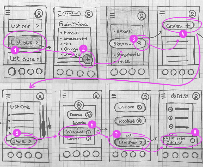
Before moving into high-fidelity designs, I explored the primary shopping journey through a series of hand-drawn wireframes. The goal was to balance familiar shopping list interactions with Aisle's core innovation — automatically adapting the shopping experience to the selected supermarket.
Flow from existing list to in store use
10. Key journey wireframes
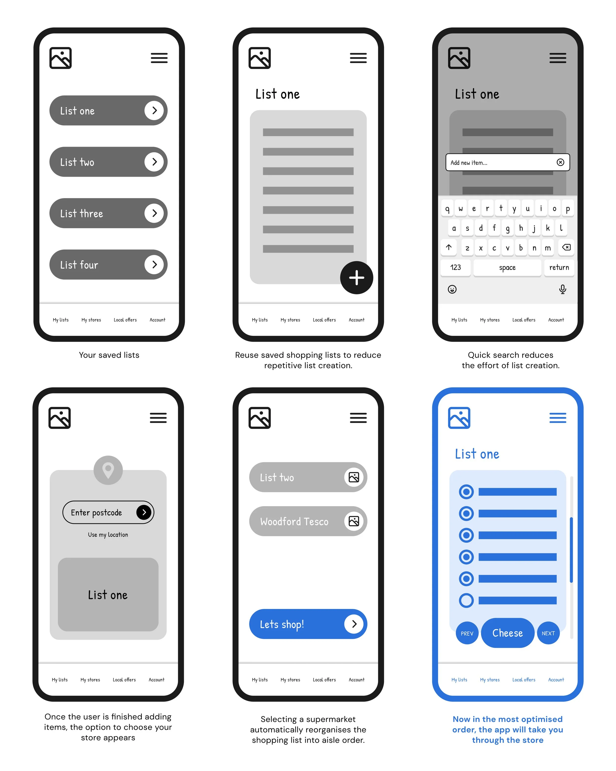
Reducing cognitive load
I streamlined the user journey to minimize friction, drastically reducing clicks so customers can activate the in-store experience instantly.
11. High fidelity prototype
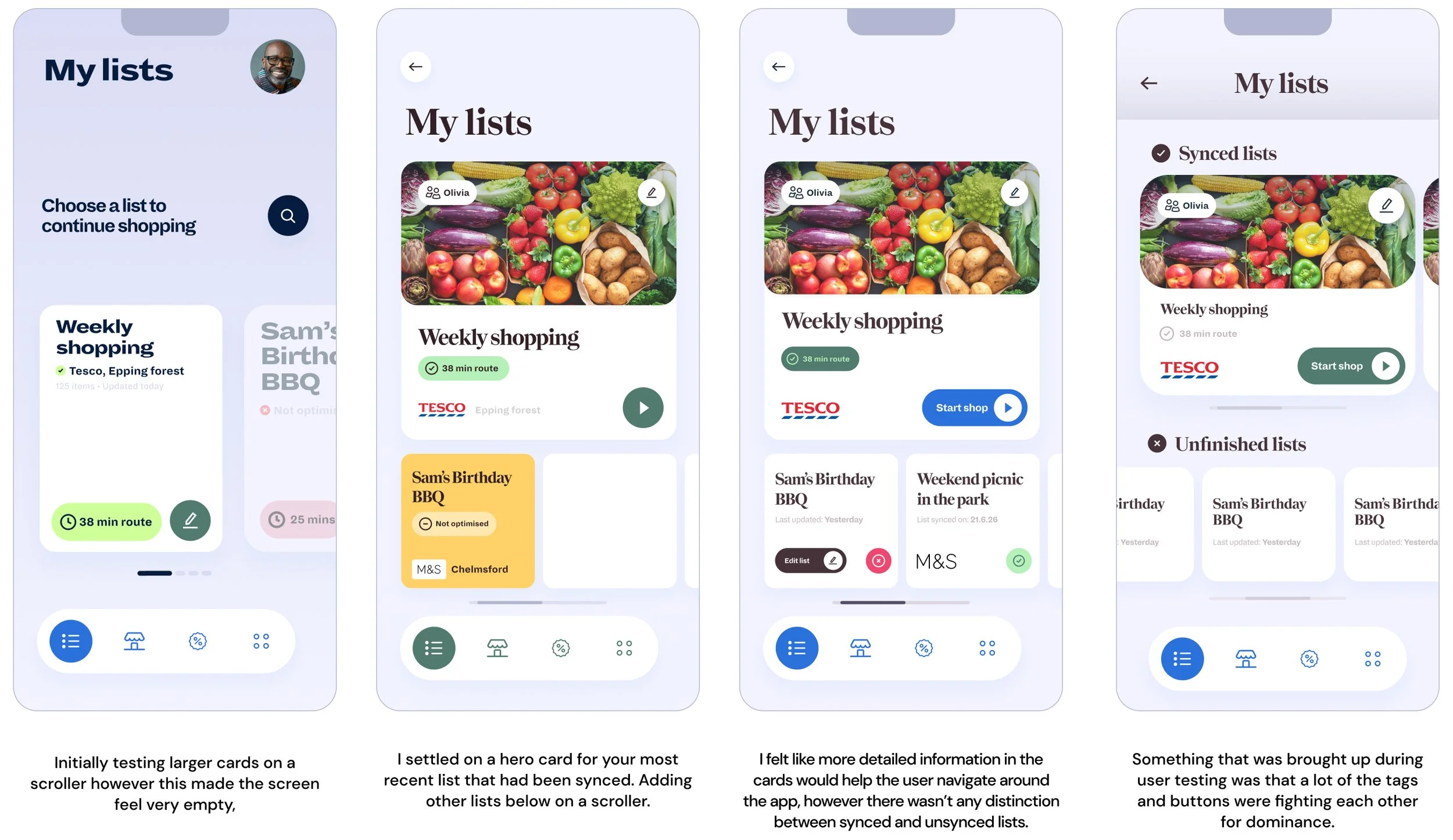
Moving on from the low-fidelity wireframes, where I focused on testing and refining the optimal user journey, I began developing the design system that would define the overall look and feel of the app.
Through multiple iterations, I gradually streamlined the experience, retaining only the essential UI elements needed to support each task. This helped reduce cognitive load and guide users through each step with minimal confusion or distraction.
12. Final designs
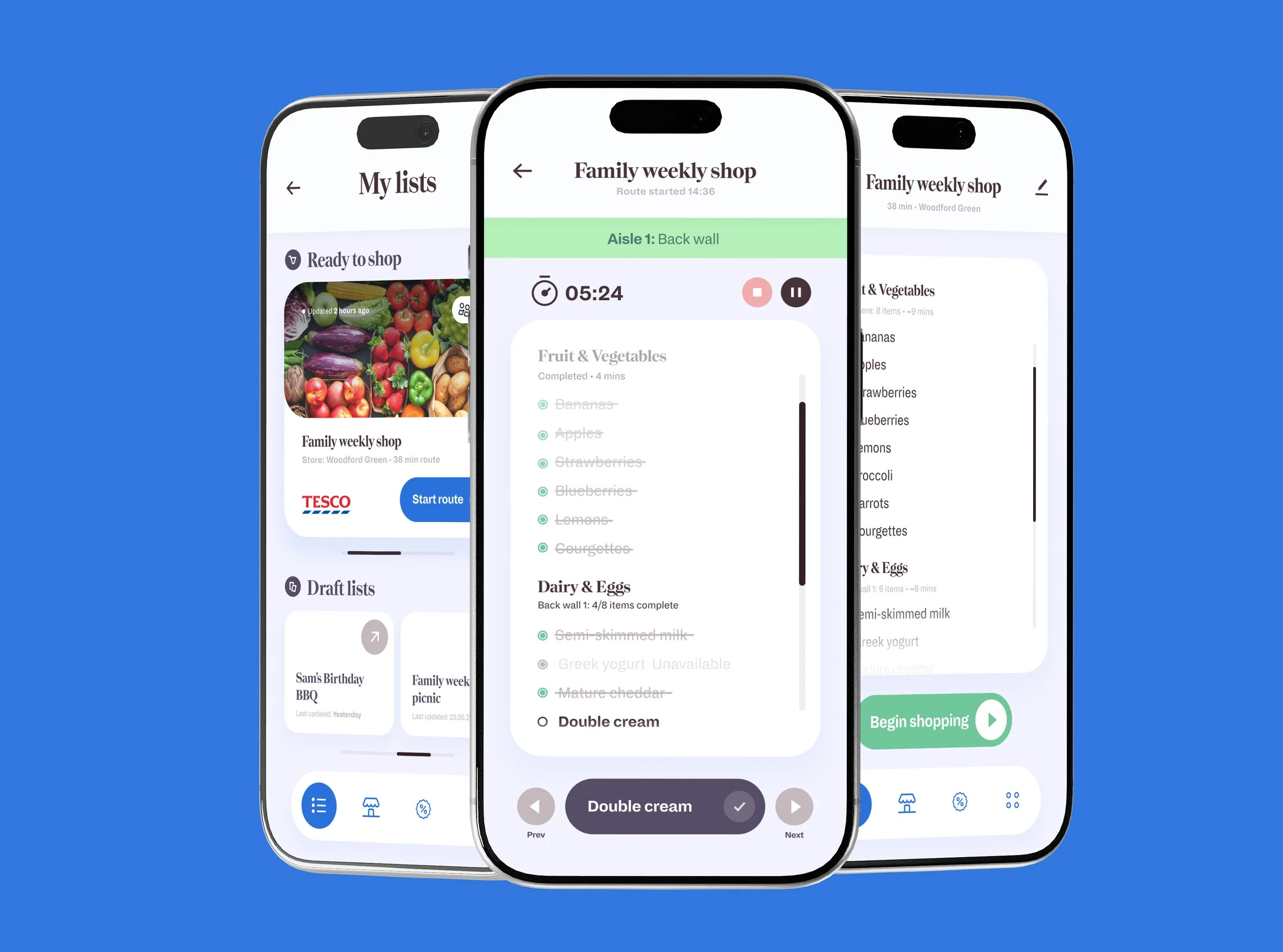
I settled on a clean and modern visual style that feels softer and more human than many competitor shopping list applications.
A muted colour palette creates a calm and approachable experience, while clear visual hierarchy and simple interactions keep the user experience intuitive and easy to navigate.
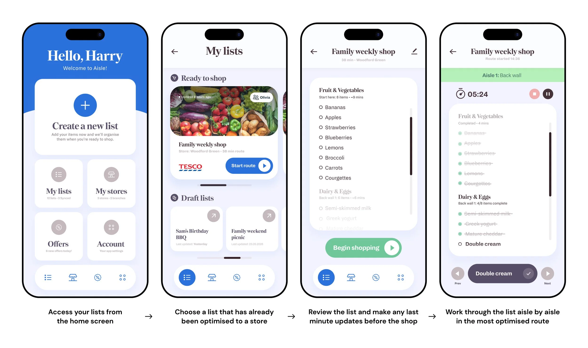
Home > My lists > Users saved list > Shop
I took the app’s most frequently used journey — opening a weekly shopping list and getting started in-store — as the starting point for developing the visual style. This gave me the most opportunities to explore the interface, experiment with layouts and establish a consistent visual language across key screens.
13. User Testing
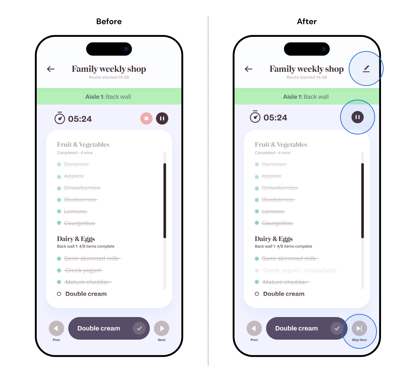
I tested the core user journey to understand whether the interface was clear and simple enough to navigate without unnecessary friction. I also used the sessions to identify any obvious gaps in the experience or features that may have been overlooked during the design process.
Through several iterations, I decided against adding a dedicated “Item unavailable” button. Instead, I introduced a simple Skip action that could handle multiple scenarios — whether an item was unavailable, the user wanted to override the optimised route, or they simply decided they no longer wanted it.
In an effort to declutter the interface, I removed the separate pause and stop buttons. Instead, the pause button transitions into a stop button once pressed, reducing visual clutter while keeping both actions easily accessible when needed.
User testing highlighted the need to edit a list while shopping. As one participant put it, “What if I suddenly remember I need parsley for that pasta tonight?” Rather than forcing users to leave the shopping journey, I reintroduced the edit action in the top-right corner. Keeping it in the same familiar position used throughout the list-creation experience makes the interaction predictable and easy to discover, while maintaining a clean interface.
14. What I learned
Optimisation needs flexibility
No matter how optimised the shopping experience may be, there will always be situations where users need to take control. Testing highlighted the importance of being able to manually override the route and add or remove items on the fly, without introducing unnecessary steps that could create frustration or confusion.
Simplicity doesn't mean removing functionality
Several iterations involved removing controls to create a cleaner interface, but testing showed that some functionality still needed to remain accessible. The challenge was finding simpler ways to expose these actions, rather than simply removing them.