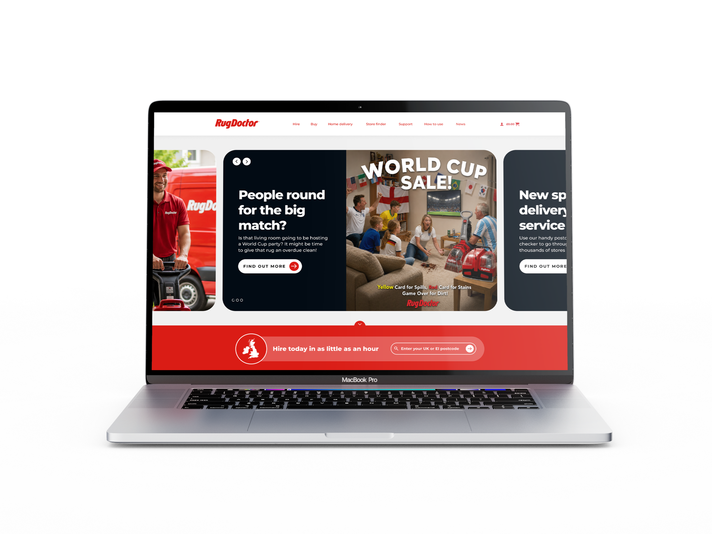
We worked alongside Rug Doctor to identify where customers were dropping off during the hiring journey, and redesigned key touchpoints to reduce friction and increase hire completion.
01. Overview
Role
UI/UX Designer
Project Type
UX Design / CRO
Platform
Figma, Wordpress
Customer journey and conversion optimisation
Focus
Rug Doctor approached us to identify user drop-off points in their website's rental funnel. While satisfied with their booking system, the journey leading up to it, specifically the link from the homepage to the rental page, was causing friction. Our goal was to streamline this pathway and guide more users into the booking flow.
Problem
High site traffic, lower hire completions.
Solution
Reduce customer fatigue through the user flow.
Outcome
Increase in machine hires directly through site.
02. The Problem
The client had strong site traffic, but far fewer customers were completing the machine hire process through the online portal. They needed to understand where users were dropping off, why it was happening, and how to remove barriers to completion, ultimately increasing the number of sales made directly through the website.
This suggested that the issue wasn’t a lack of demand, but a lack of clarity in the journey. Customers were arriving with intent, but the path from interest to hire was not direct enough. The challenge was to identify where friction was being introduced and redesign key touchpoints so users could move more confidently towards booking.
03. The Opportunity
By improving the user journey to hiring through the Rug Doctor website, you can reduce reliance on external channels such as in-store advertising, which can be costly and makes it more difficult to accurately track customer behaviour and conversion.
The website also provides a valuable source of behavioural data, allowing you to understand how customers interact with the journey. For example, do they browse the products and information presented on the site before hiring, or do they bypass these pages and go straight to the hire portal?
If customers are consistently showing interest in particular products before hiring, this behaviour could provide valuable insight into which products should be prioritised across other marketing channels — from social media and digital advertising to in-store promotions and displays.
This creates an opportunity to use real customer behaviour to identify friction points, optimise the hiring journey and make more informed decisions about where and how products are promoted.
04. The Research
The existing user journey
We mapped the existing journey to understand where customers were entering, what they were interacting with and where friction was causing drop-off.
Key findings:
Despite a prominent link to the hire journey on the homepage, relatively few customers were using it to access the hire page. Instead, the navigation menu was receiving noticeably more clicks, suggesting the primary CTA was not effectively guiding users towards hiring.
The homepage had limited visual hierarchy, making it difficult for customers to understand where to focus and which actions to take. This contributed to increased cognitive load and a less intuitive user journey.
Customers found the hire page overly text-heavy and overwhelming, making it harder to quickly understand the process and take the next step.
A significant number of customers were dropping off early in the journey, indicating clear opportunities to reduce friction and improve the path from initial engagement through to hire.
The key issue wasn't a lack of customer interest in hiring. It was friction within the journey. Customers were finding alternative routes to hiring, but the existing experience wasn't effectively guiding them from discovery to conversion.
05. Success metrics
We agreed that success would be measured by:
More customers progressing from the homepage into the hire journey.
Fewer customers abandoning between the homepage, hire page and hiring process.
A simpler, more direct path from intent to starting a hire.
Customers able to quickly understand how hiring works and what they need to do next.
06. User flow
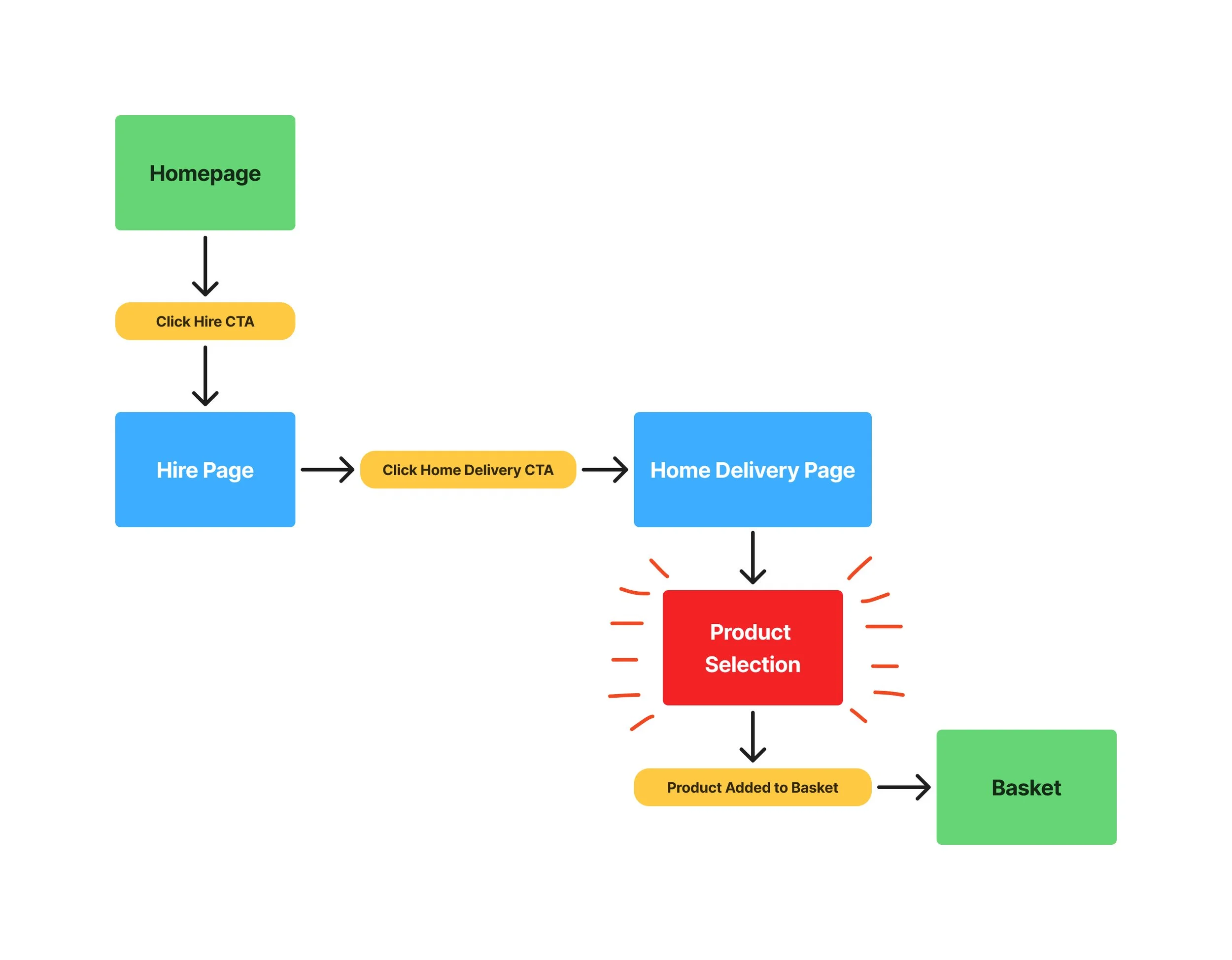
The existing user flow:
The main area of friction was the Home Delivery page, particularly the product selection section, where users had to compare machine hire options and add-ons before moving forward.
This section felt congested and difficult to scan. There was little visual distinction between high-value machine hire options and lower-value add-ons, such as accessories and cleaning sprays. While the product selection area was creating cognitive overload, the deeper issue was that users were already fatigued by the time they reached this point in the journey.
By this stage, the journey had already required too much effort, making it harder for users to stay engaged and continue towards hire.
The issue was clear: drop-off location wasn’t the real problem — the effort required to reach it was.
Updated user flow:
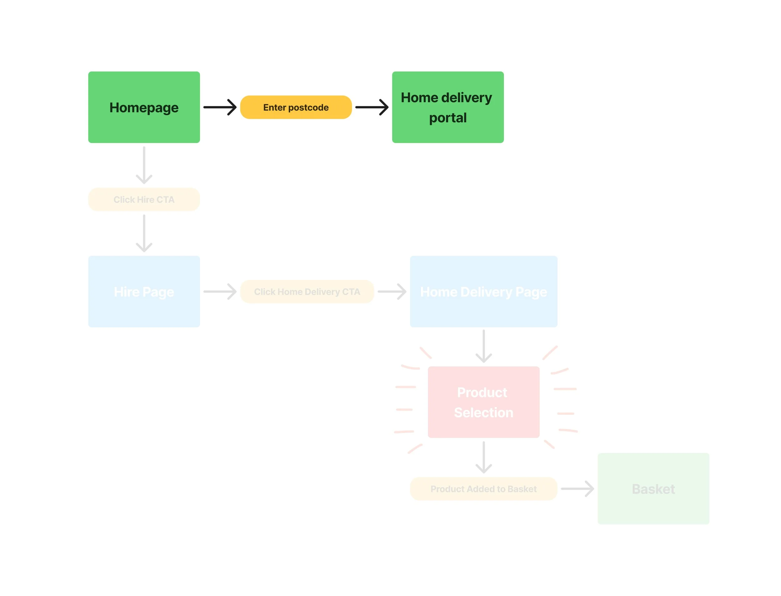
Once I had identified the core issue, I began exploring ways to simplify the journey and reduce the effort required to reach the hiring portal.
Because the existing route to the hiring portal was too long and demanding, I focused on how customers could be directed there immediately from the homepage.
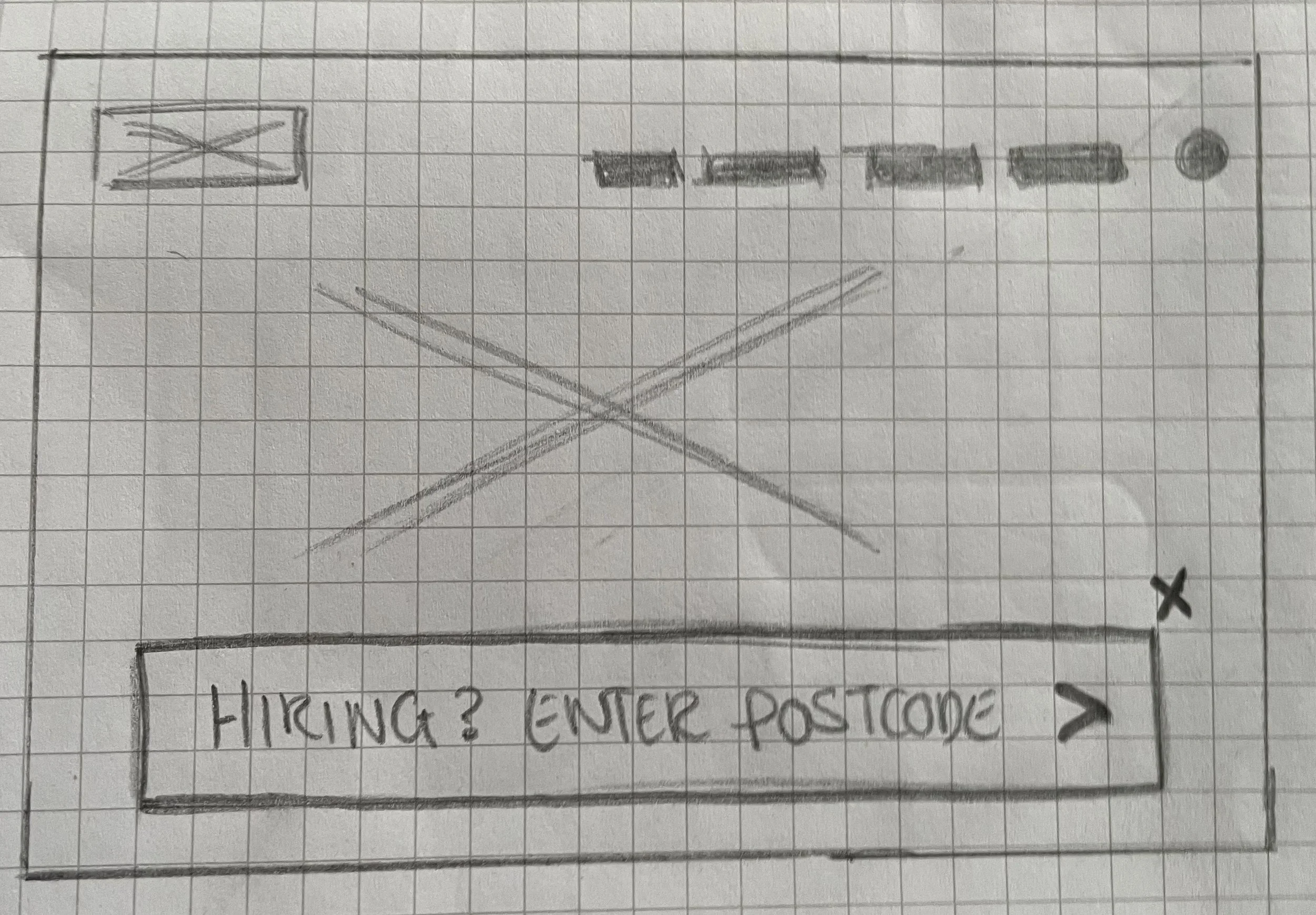
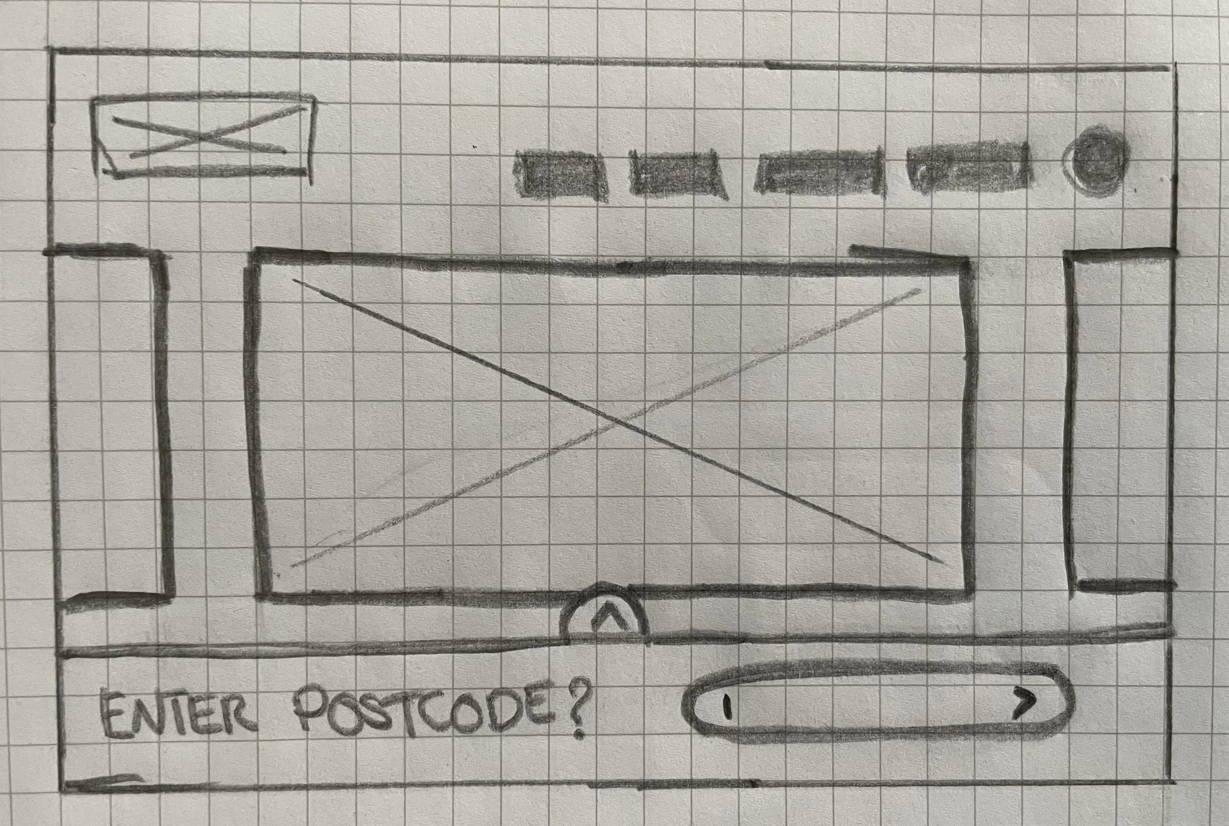
I proposed adding a postcode search box to the homepage header, giving customers a direct route into the hiring portal and reducing the journey from seven clicks to one.
This reduced the number of required clicks by 85.7%.
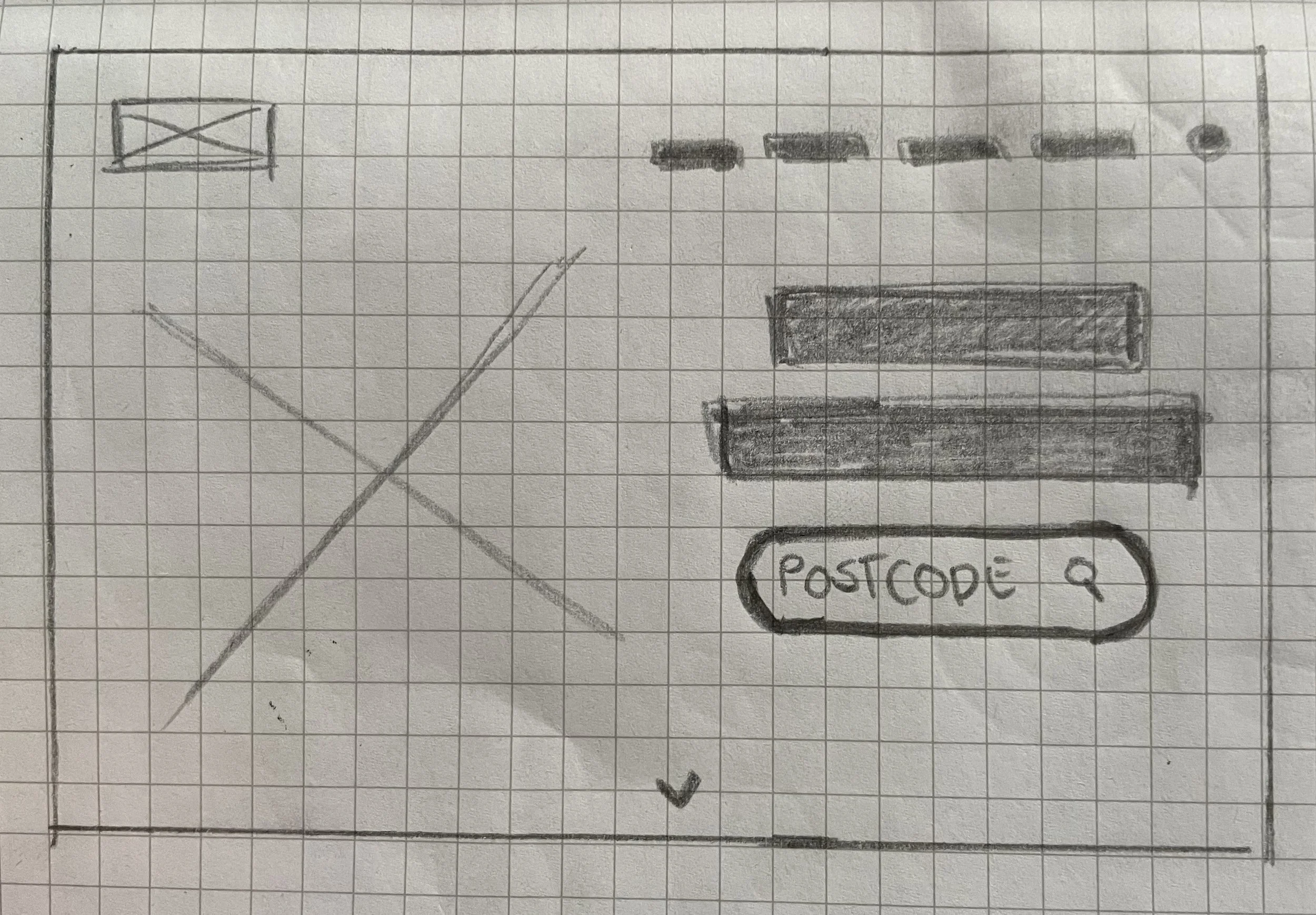
07. Rough wireframe exploration
Before moving into high-fidelity designs, I explored a series of rough wireframes to test different ways of guiding customers from the homepage header directly into the hire portal using the postcode search.
08. Early development
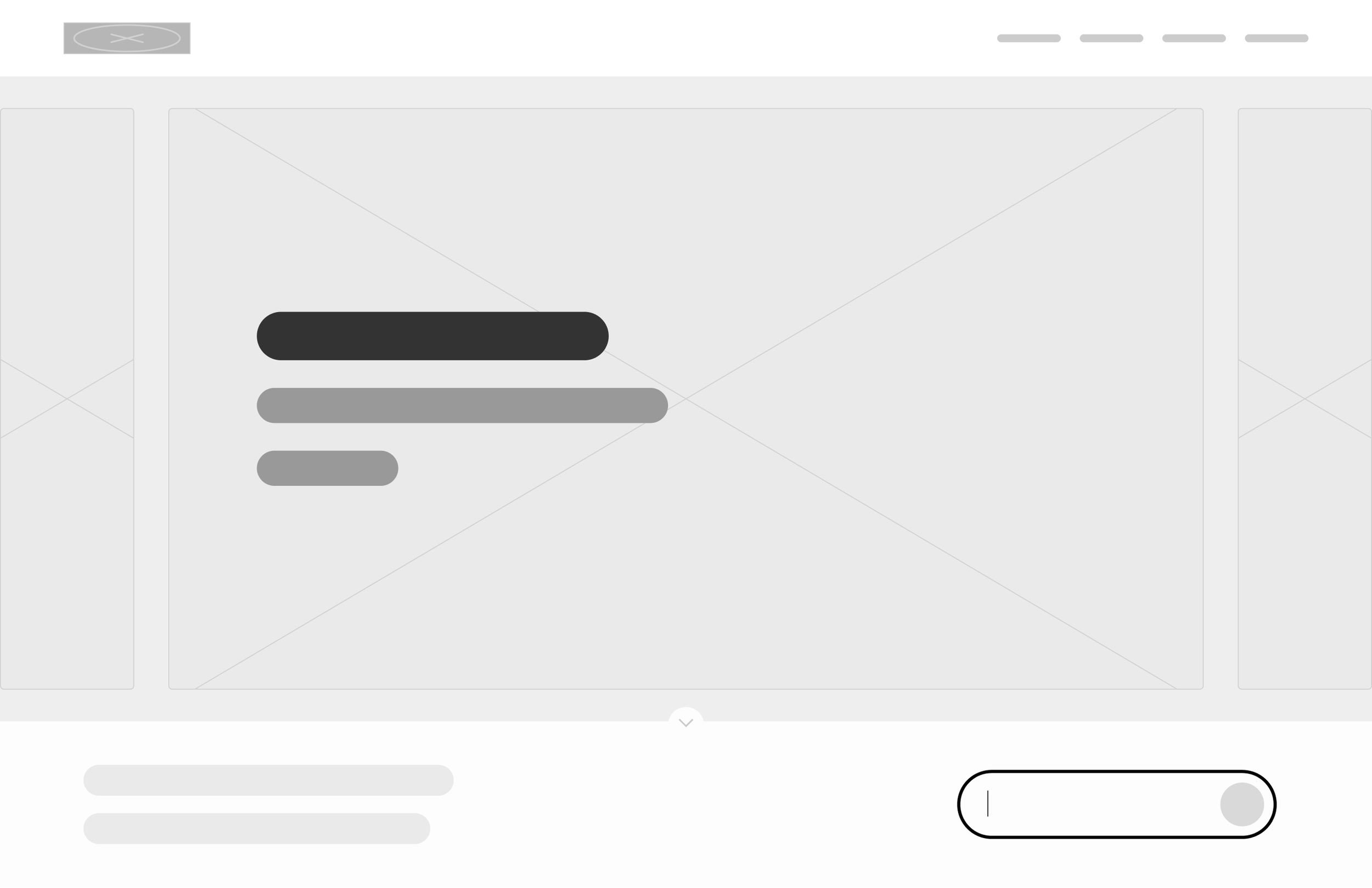
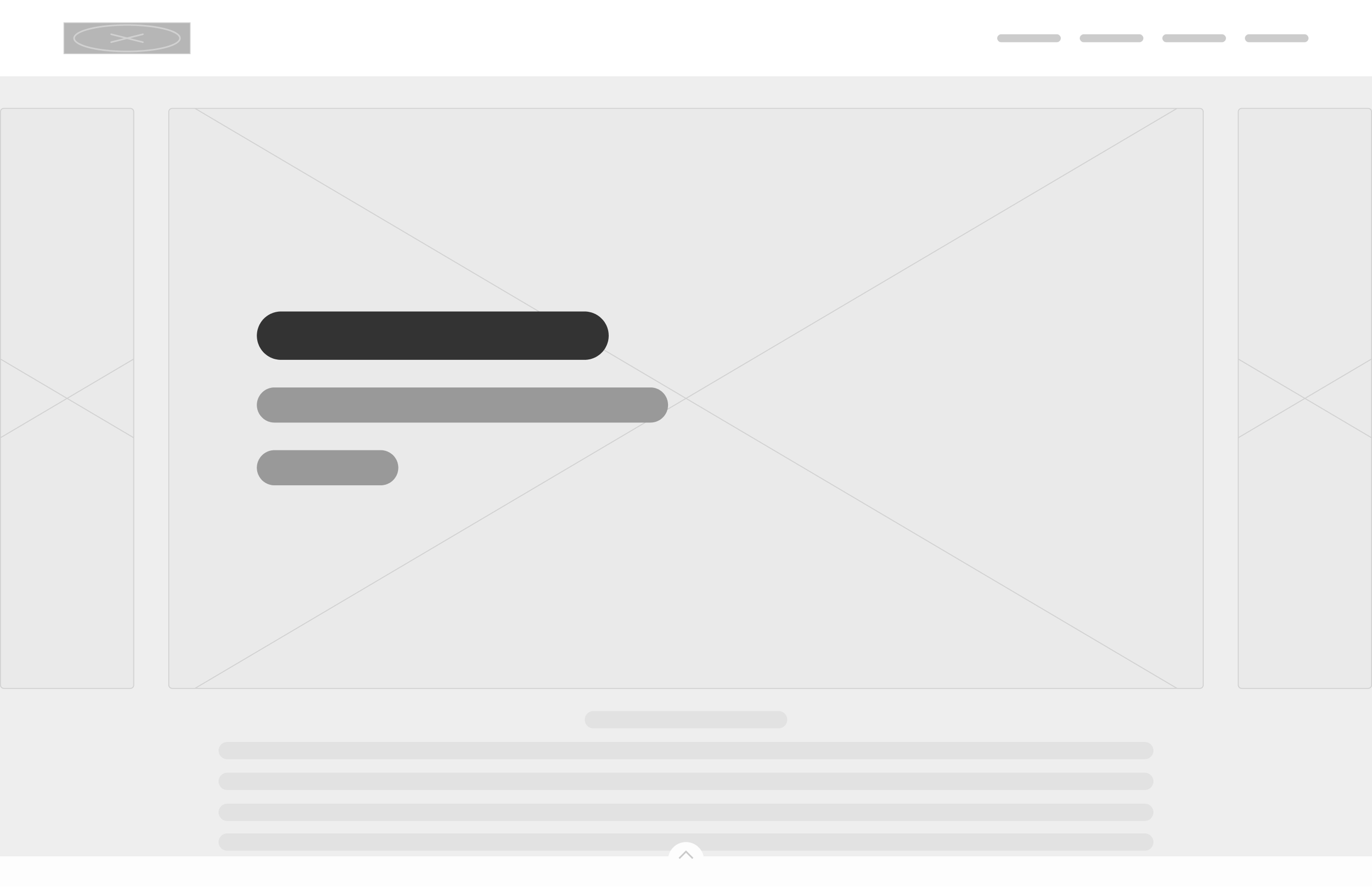
After speaking with the client, we agreed on a hovering box anchored to the bottom of the homepage, providing a clear route to the hire portal while remaining unobtrusive. Users can also minimise the box if they don’t need it.
A key concern for the client was balancing the need to guide users towards the hire portal without disrupting those visiting the website to explore other products or services. This approach provides a prominent call to action for users who need it, while allowing others to easily minimise it and continue browsing.
09. High fidelity designs
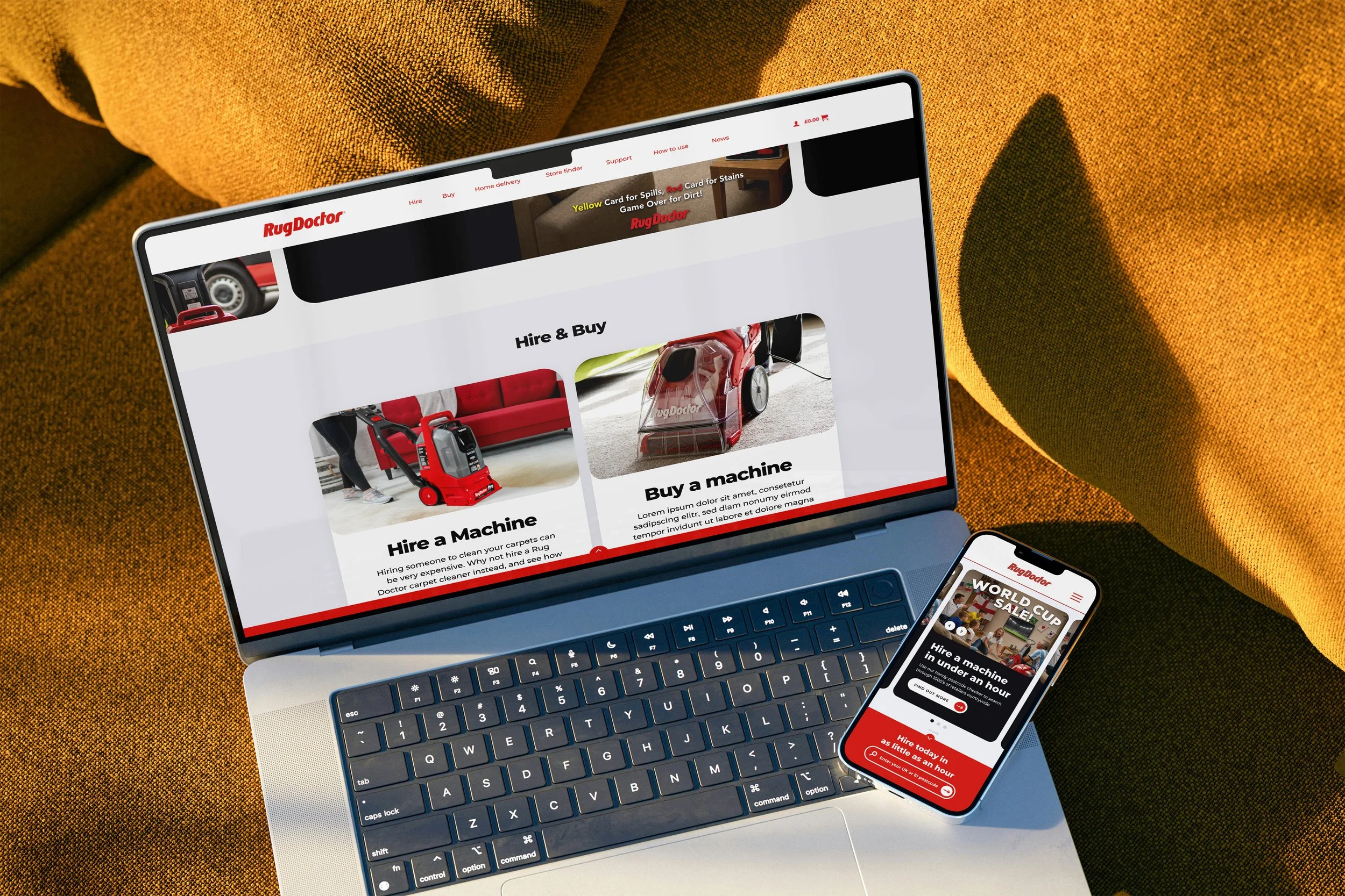
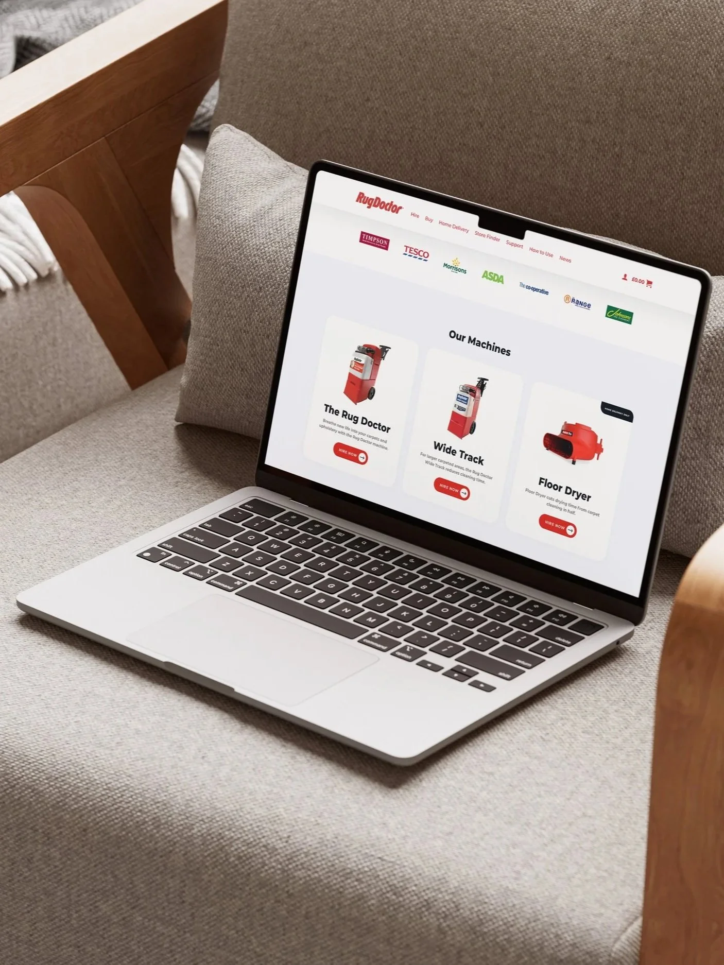
With the direction agreed, I moved into high-fidelity designs, using a bento-style layout to create a more modern, engaging and user-friendly experience. I also refined the hire search interaction, allowing the bar to expand and collapse so it remains accessible without competing with the rest of the homepage.
With the direction agreed, I moved into high-fidelity designs, using a bento-style layout to create a more modern, engaging and user-friendly experience. I also refined the hire search interaction, allowing the bar to expand and collapse so it remains accessible without competing with the rest of the homepage.
10. Testing & validation
Following the initial design development, the proposed experience was reviewed and tested by the Rug Doctor team. I wasn't directly involved in this testing, so the results aren't included here, but client feedback was used to refine the final designs before implementation.
Below are a few examples of the feedback received and how it informed the final designs.
Iteration 1: Responsive Hire & Buy
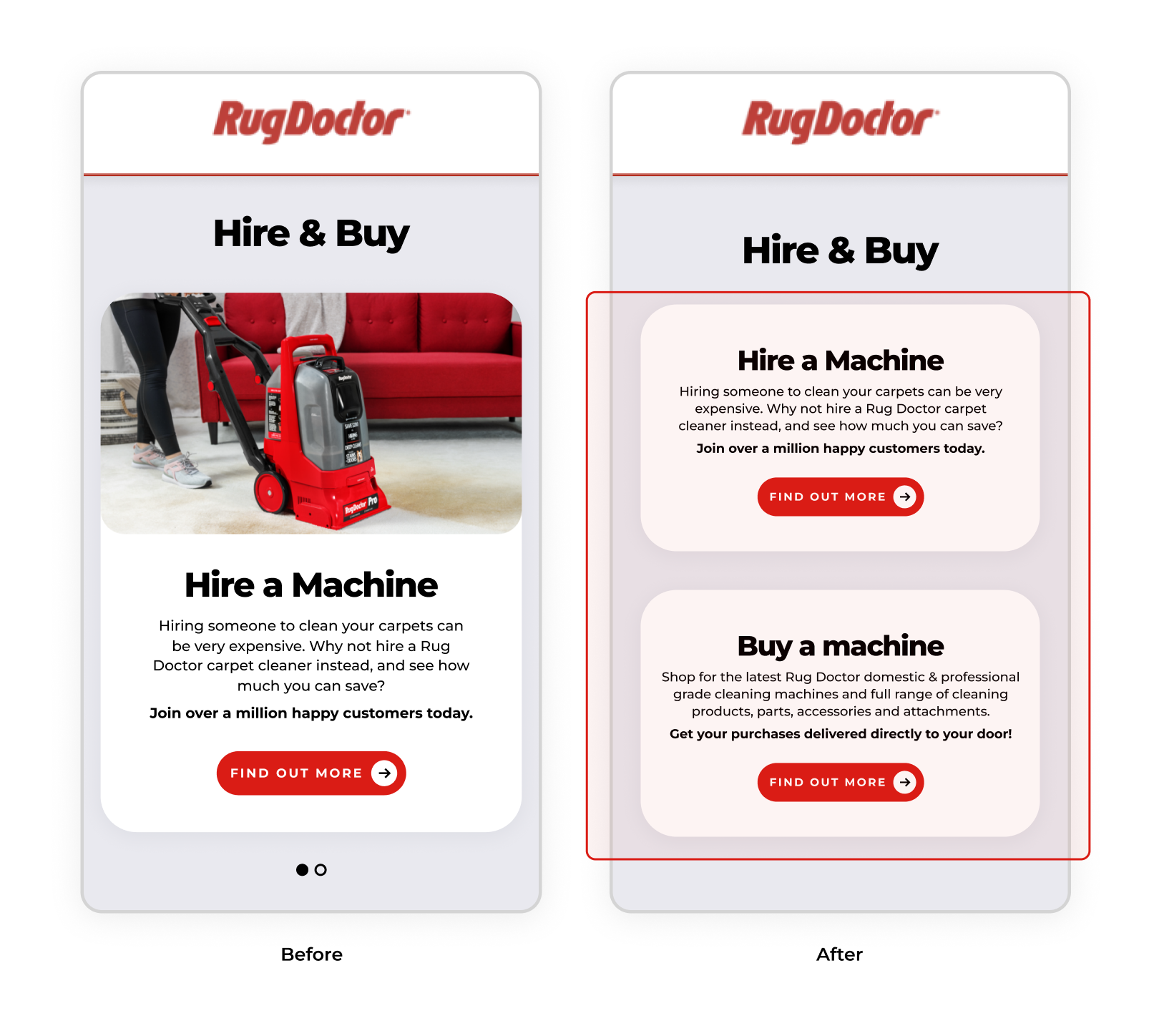
While presenting the responsive designs to the client, a concern was raised around the ‘Hire & Buy’ section collapsing into a horizontal scroller on smaller screens. With only one card visible at a time, there was a risk that users could miss the second option.
To address this, I removed the card imagery at a defined breakpoint and stacked the cards vertically. This ensured both options remained immediately visible and accessible, regardless of device or screen size.
Iteration 2: Header Signposting
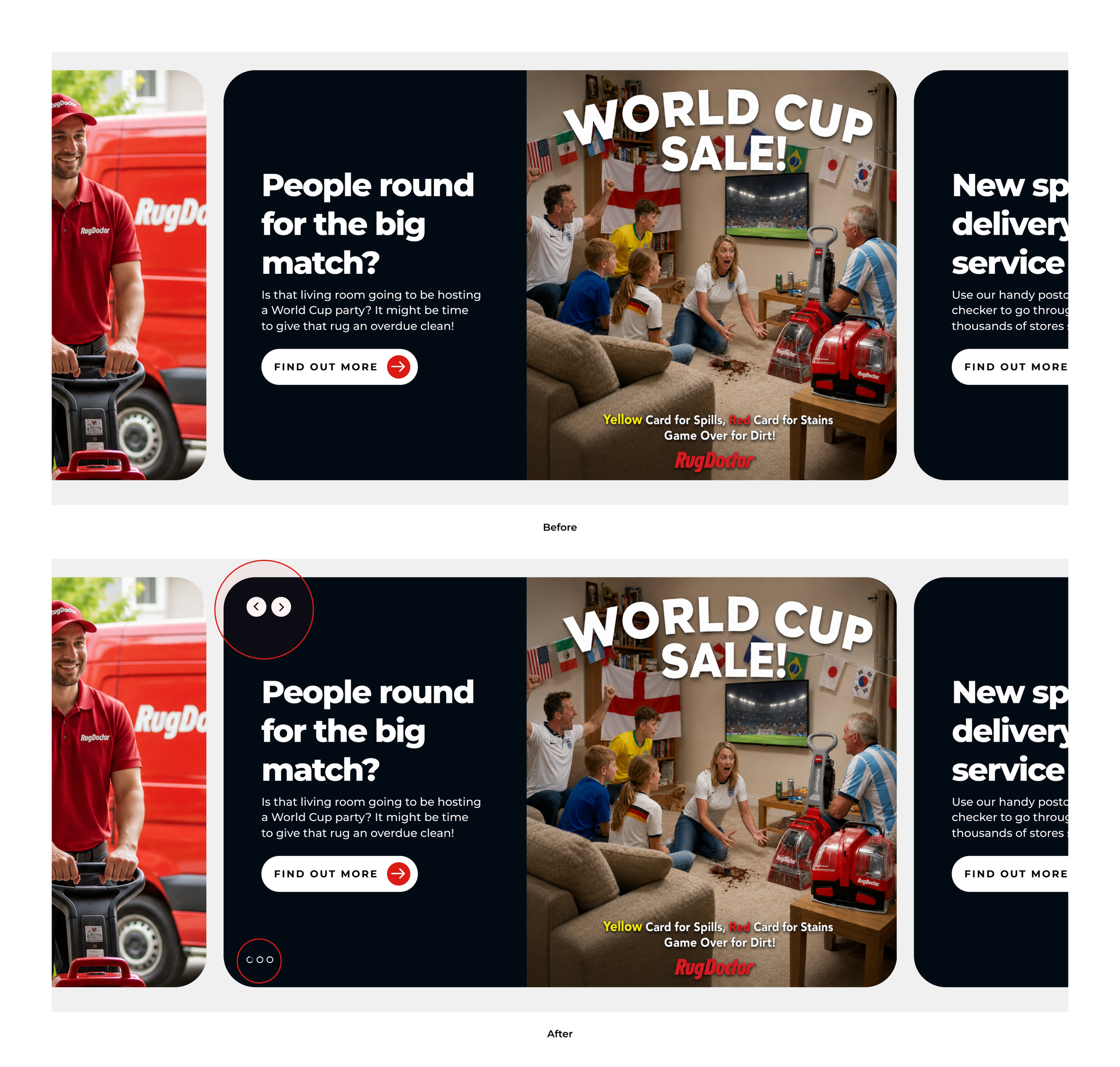
A key concern raised by the client was that the header lacked visual signposting. While the minimal, Bento-style approach was well received, there was a risk that users wouldn't realise the header was horizontally scrollable or understand how many content panels were available.
To address this, I introduced clearer visual cues for the horizontal navigation, making the interaction and available content more apparent without compromising the clean, minimal aesthetic
Iteration 3: Simplifying the Postcode Search
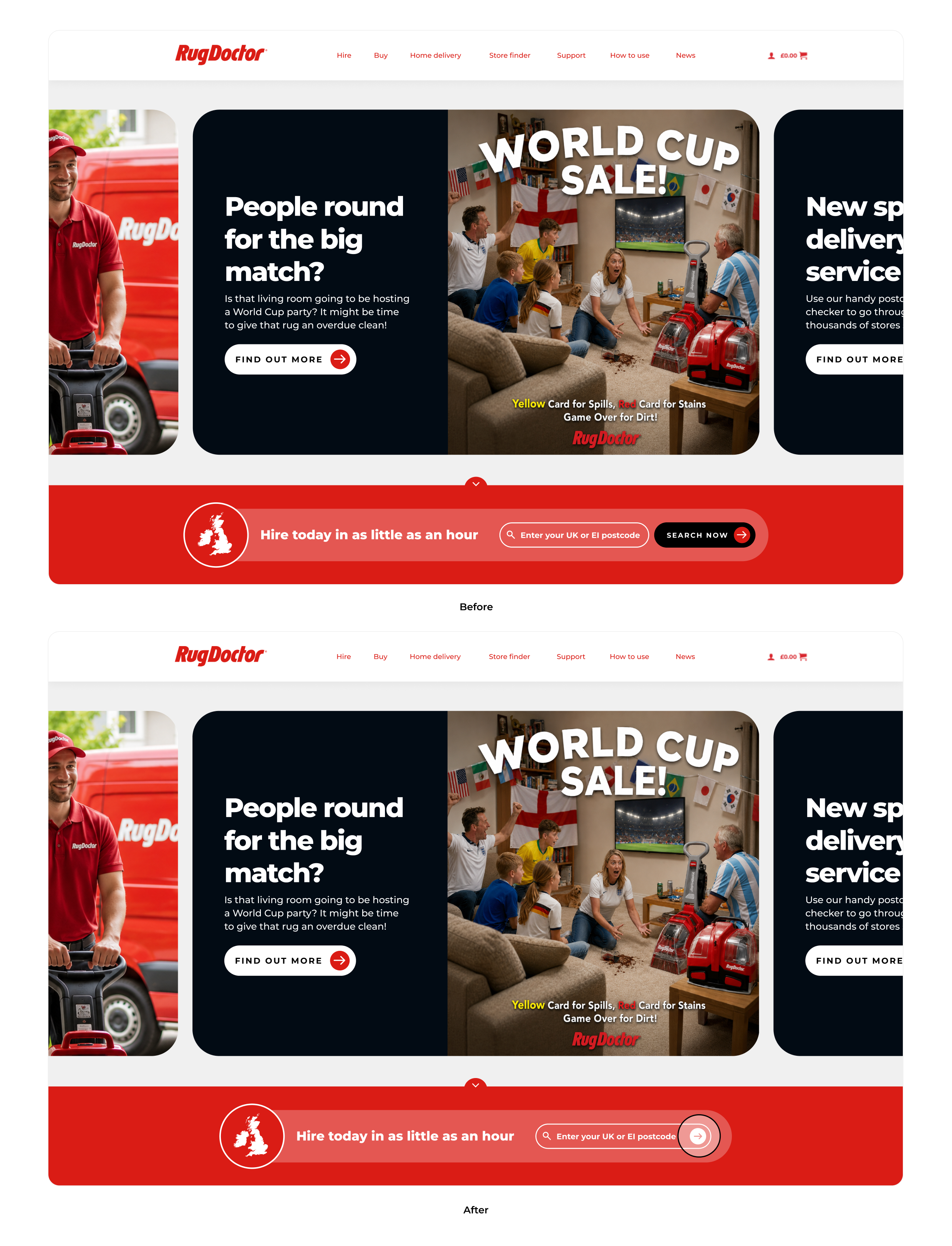
I like to take the approach of “Is it serving a purpose? No? Get rid.”
In this case, removing the ‘Search Now’ CTA made sense. The postcode field already clearly communicated the action, so the additional button was unnecessary.
This also helped keep the component simple and responsive, allowing it to adapt to smaller screens without requiring significant changes to the layout.
Did the redesign achieve what we set out to do?
11. Final Outcome