

We were brought in by Centtrip to assess their banking app's existing UI, identify areas of friction, and recommend improvements to create a clearer, more intuitive user experience.
01. Overview
Role
UI/UX Designer
Platform
iOS App
UX / UI Design Consultancy
Project Type
UI Optimisation & Usability
Focus
Centtrip approached us to help assess the initial designs for their mobile app. They already had an early version, but weren’t happy with how it was working. They couldn’t quite put their finger on what felt wrong, they just knew the experience wasn’t quite where it needed to be.
Our role was to step back from the existing designs and identify the underlying issues before jumping into solutions. We reviewed the app from a user’s perspective, looking at everything from navigation and information hierarchy to the visual language and interaction patterns.
02. Problem
With the currency exchange market becoming increasingly saturated, Centtrip were concerned about keeping pace with competitors. Many of their competitors already had slick, modern mobile experiences, while Centtrip felt their own app was beginning to look and feel dated.
I was brought in on a purely consultative basis. The brief wasn’t to redesign the app or revisit the existing brand, but to identify where the current experience was falling short, understand why, and provide clear recommendations for improvement.
My role was to assess the existing designs, highlight potential UX and UI issues, suggest practical fixes, and identify opportunities to improve the overall user experience.
03. The Approach
A breakdown of what was working
Before identifying the problems, I looked at the existing experience to understand which elements were already working well and should be retained or built upon.
Clear transaction status
The three sections; ‘Cleared, Pending and Cash’ give the user a clear breakdown of their spending and make an important distinction between the different states of their money. The structure is simple, easy to scan and creates a natural separation between the main sections of information on the screen.
Intuitive currency navigation
The ability to scroll through available currencies is simple and easy to navigate. Using the currency flag as a visual identifier is a nice touch. It provides an instantly recognisable cue that allows users to identify currencies quickly without having to rely solely on the currency name or code.
Familiar visual language
Green is used to represent money coming into the account within the transaction list. This creates an immediate visual association with a positive transaction and makes it easier for users to distinguish money coming in from money going out at a glance.
Where the experience was falling short
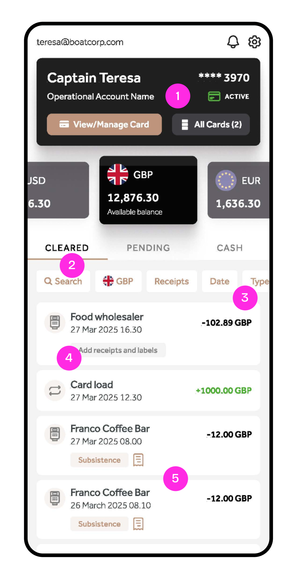
Having identified the elements that were working well, I then looked more closely to identify areas that could be creating friction for users.
The aim was to understand what was contributing to Centtrip’s concerns and, more importantly, why the experience was beginning to feel dated and difficult to use. I focused on areas such as information hierarchy, navigation, brand consistency and the amount of information presented to the user.
1. The header is trying to do too much
The header contains a lot of information within a relatively small space. This forces the two CTAs to be smaller and places them very close together, making the actions feel cramped rather than prominent.
2. Search is being treated like a filter
The search bar is visually grouped with the other filter options, despite serving a different purpose. Search is a primary way of finding a transaction, whereas the other controls refine the results. Giving them the same visual treatment makes this distinction less clear.
3. Transaction tags are getting lost
Tags such as Date and receipts are useful for understanding and categorising transactions, but they have very little visual prominence. They become easy to overlook amongst the other information in each transaction.
4. Iconography lacks consistency
The icons used throughout the interface don't feel like they belong to the same visual system. Differences in style and treatment reduce the sense of cohesion and make the interface feel less polished.
5. Transaction cards are overcrowded
Each transaction card contains several layers of information, including the merchant, date, time, amount, tags and additional actions. While all of this information may be useful, the current layout gives little indication of what should be prioritised, making the cards feel dense and harder to scan.
04. The opportunity
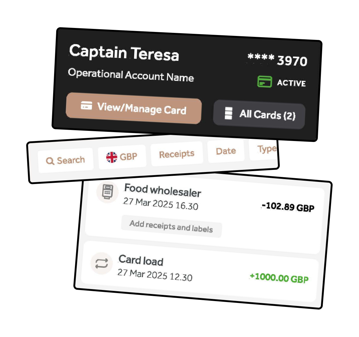
Having identified the key areas of friction, I began to translate these findings into opportunities for improvement. Rather than redesigning the entire app, I focused on where relatively targeted changes could have the biggest impact on clarity, usability and consistency.
Create clearer hierarchy
Information overload is one of the biggest issues with the current UI. There’s a lack of clear visual hierarchy, making it difficult for users to distinguish between primary information, secondary details and actions.
This can lead to hesitation as users navigate the app, particularly when searching for specific transactions or trying to understand their overall financial information. A clearer hierarchy would allow users to scan the interface more easily and find what they need with greater confidence
Recommendation: Establish a clearer distinction between primary and secondary information, allowing users to scan the most important content first.
Simplify interactions
The hierarchy of interactions isn’t clear. Search and filtering are presented in a similar way, making it difficult to understand their different purposes. At the same time, the CTAs are given equal visual weight, while the currency selector competes with the main header for attention.
A clearer interaction hierarchy would help users quickly understand what they can do, where they should start and which actions are most important, making the experience feel simpler and more intuitive.
Recommendation: Give different functions appropriate levels of prominence and make the purpose of each interaction immediately clear.
Build a more consistent visual system
The iconography lacks consistency, with several different visual styles being used throughout the app. This creates a messy and unpolished experience, making the interface feel less considered than it should.
For a product where users may be managing significant amounts of money, visual consistency is particularly important. Establishing a clear and consistent icon style as part of a broader brand kit would create a more cohesive experience and subconsciously reinforce a sense of trust and professionalism.
Recommendation: Introduce greater consistency across components so the interface feels like one cohesive product rather than a collection of individual elements.
05. Recommended direction
Building Brand Cohesion & Consistency
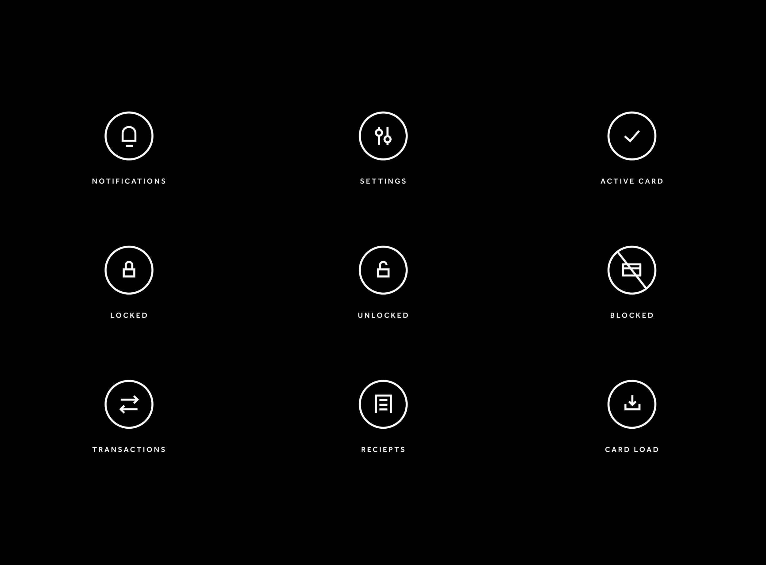
Icons are a key part of financial apps, helping users quickly find what they need. The original icons felt mismatched, so a clean icon set was created to pull the whole look together.
Matching Shapes: Every icon is enclosed in a simple circle, giving the app a uniform look across menus, status updates, and transaction lists.
Consistent Line Thickness: The lines and curves were balanced across every icon so they look sharp and easy to recognise on any phone screen.
Clear Symbols: Custom designs were created for key account states like Locked, Unlocked, and Blocked, making it instantly clear whether a card is safe to use.
Refining the App UI
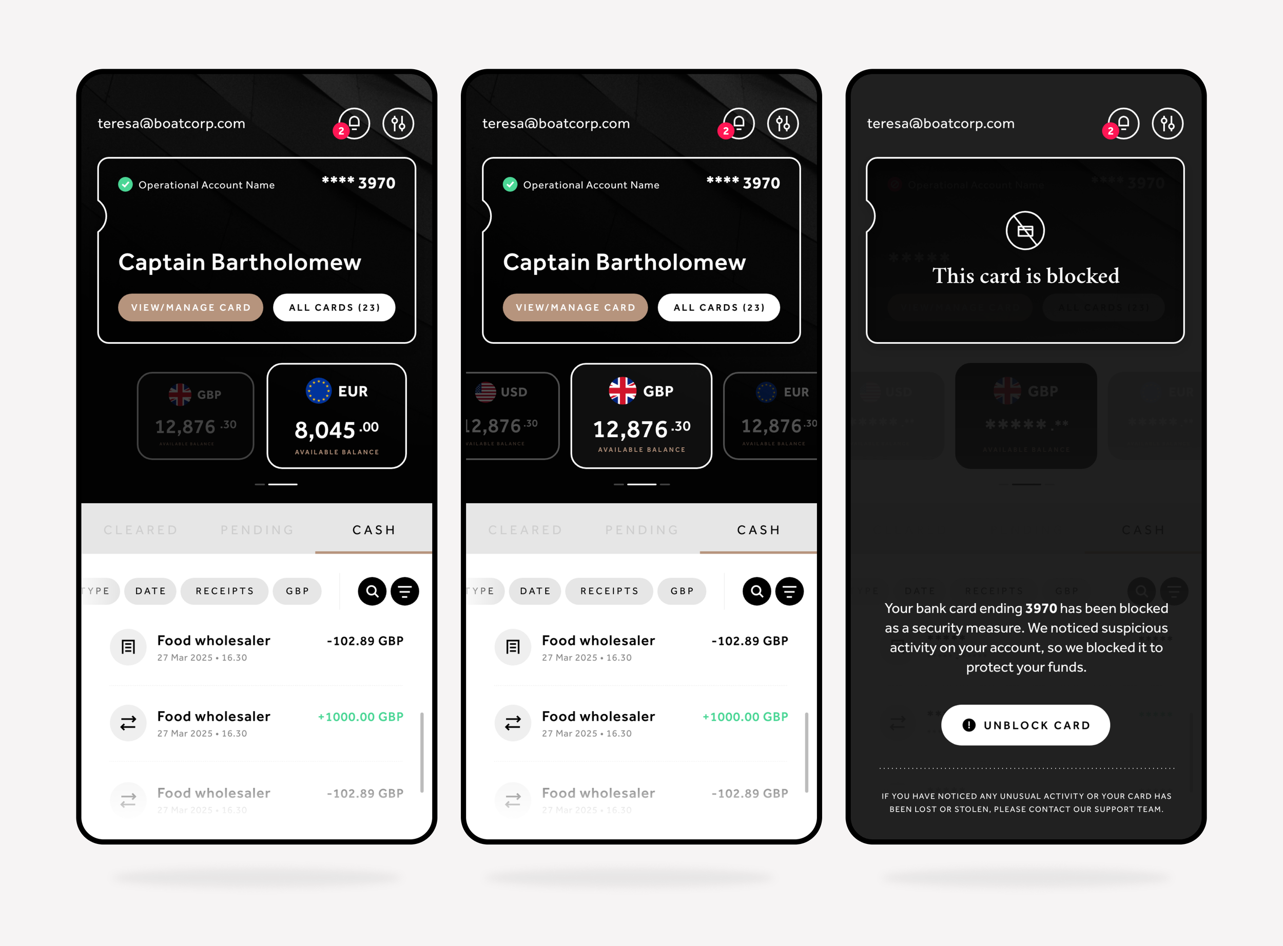
The focus was on making the app feel cleaner, easier to use, and more modern without disrupting how existing users navigate it.
Clearer Main Actions: Key buttons like managing card settings or unblocking a card now use simple pill-shaped containers. This makes the next step obvious and speeds up common tasks.
Easier to Read: Spacing around account balances, currencies, and recent activity was opened up. The clearer layout makes it effortless to scan numbers at a glance.
Simple Security Alerts: The blocked card screen was simplified to focus entirely on what happened and how to fix it, reducing stress when a card is locked